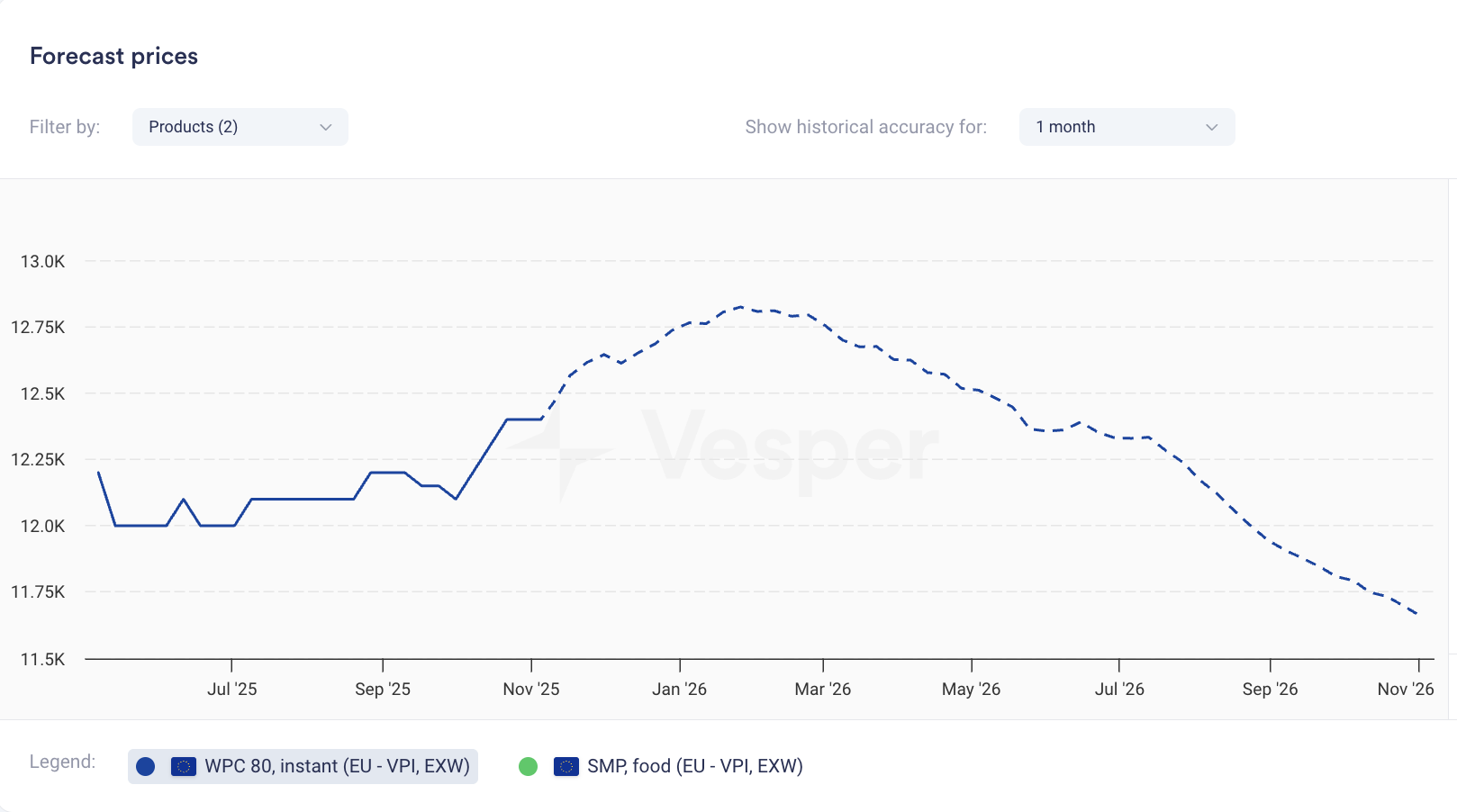
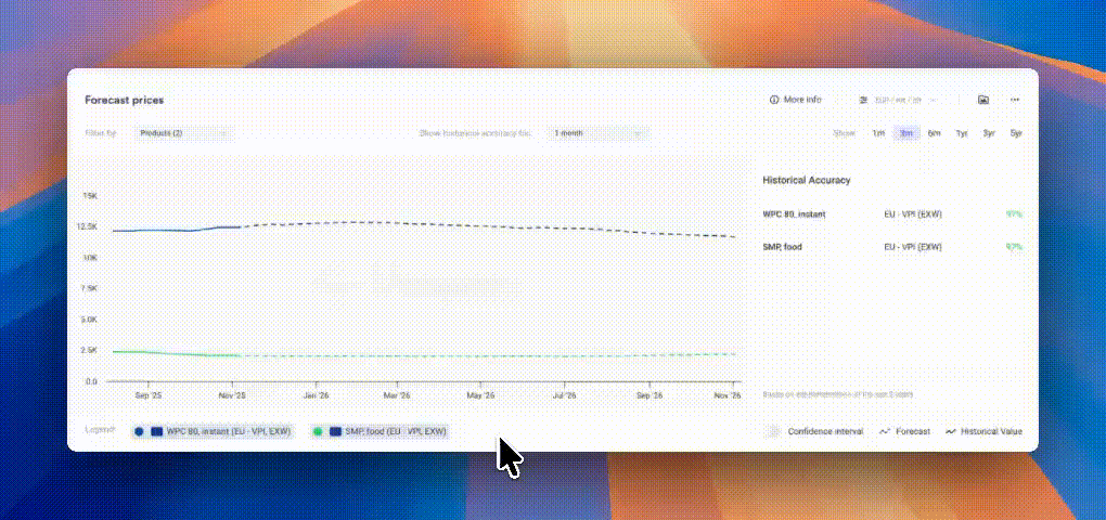
Vesper has added forecasts on 1,800+ additional price series, covering both Vesper's own data and third-party sources. All forecasts run up to 52 weeks ahead.
What's new:
1,800+ new Vesper Forecasts now live
Coverage includes US price series added through recent partnerships, European series, and Vesper Price Index benchmarks
All forecasts run up to 52 weeks ahead with confidence intervals
This is a major expansion for US-sourced data in particular, where forward price visibility was previously limited
Why this matters:
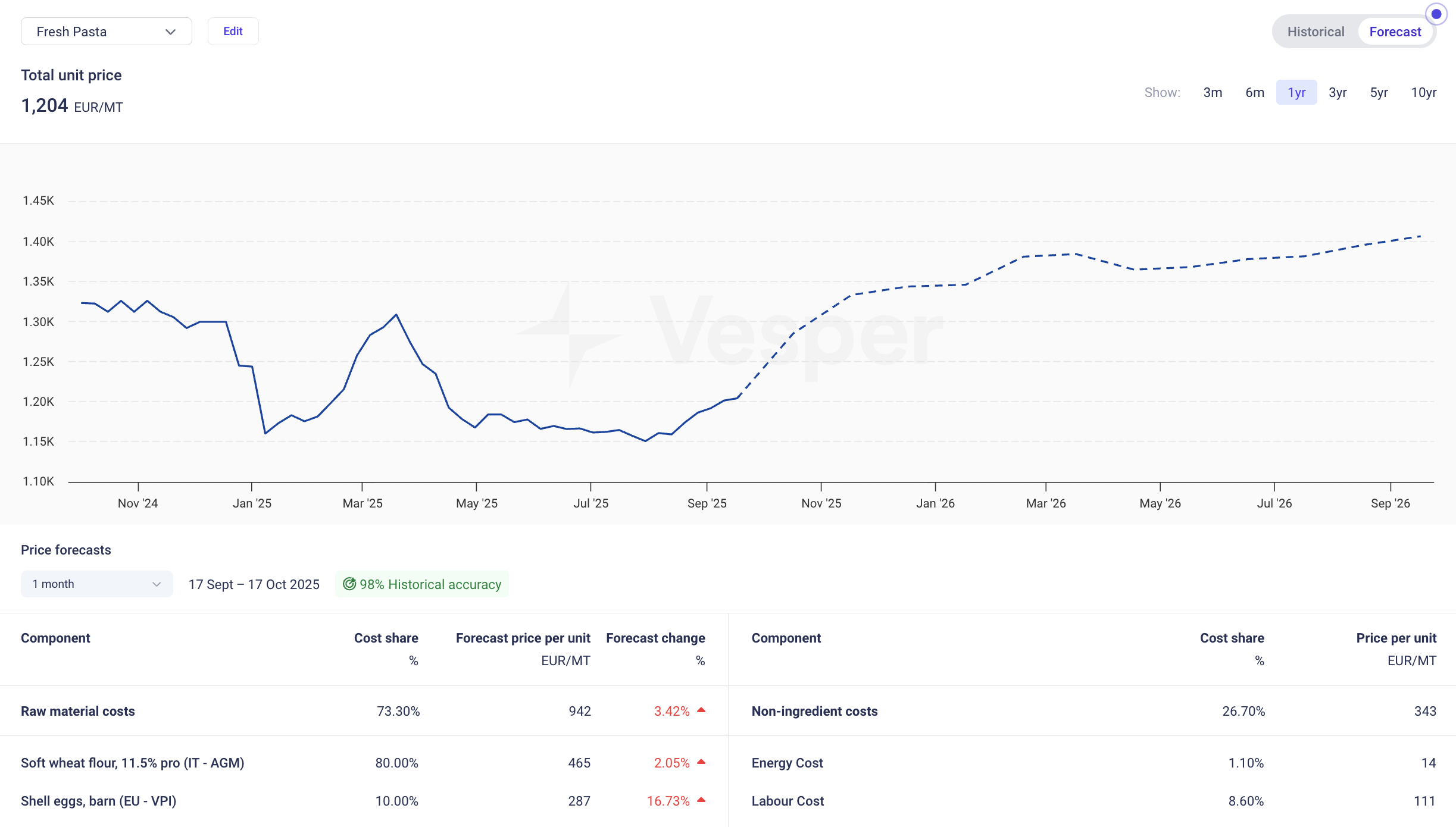
Buying decisions are forward-looking, but most price tools only show history. Vesper Forecasts give you a forecasted price for planning purchases, reviewing budgets, or deciding whether to lock in now or wait. With 1,800+ additional series covered, buyers in categories like grains, oils, meat, and packaging can access forward views for both US and European markets. And because forecasts cover third-party sources too, you get forward visibility on the same benchmarks your suppliers reference.
How to Use It:
Price Forecast widget: add any covered series to see the 52-week forward projection
How to access?
Add the Price Forecast widget to new or existing dashboards using the search function, or contact your Customer Success Manager at [email protected].