Supply and Demand Map Improvements
1738659960000
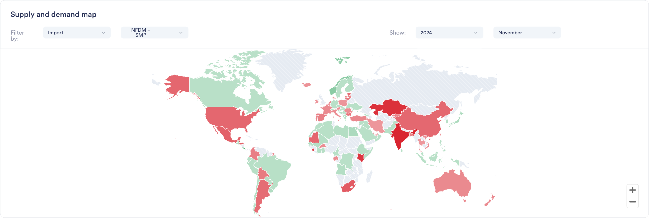
Enhanced S&D Map visualization now provides Year-to-Date (YTD) comparisons across regions, enabling instant visual insights into global production, import/export, and stock trends and regional shifts.
Why it Matters:"If I were interested to see where growth in EU milk production is happening, this would really quickly show me that it is not happening in Ireland, Netherlands or France. It's great for presentations, as not having to click through all countries at the same time makes it ideal for regions or groups of countries."
Jasper Endlich, Dairy Market Analyst
How to Use It:
Find the World Map Widget in the S&D category
Select your metric and timeframe of interest
Compare countries and spot regional trends through color coding
Export directly into presentations or add to your custom dashboards
Did you like this update?
![]()
![]()
![]()